I’ve seen it happen over and over again.
A doctor invests thousands in a beautiful website. Professional photography. Clean layout. Modern design. Then they watch their analytics and wonder why visitors leave within seconds.
The problem isn’t the website. It’s the hero section.
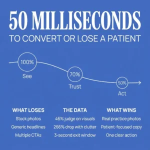
Research from Carleton University shows that website visitors form judgments in 50 milliseconds. That’s faster than a heartbeat. Faster than conscious thought. For medical practices, that split-second window determines whether a potential patient books an appointment or clicks away to a competitor.
Here’s what makes this even more critical: 46.1% of users judge your credibility based on visual appearance, not content. They’re not reading your credentials or patient testimonials. They’re making a gut call about whether you’re trustworthy based on what they see in that first moment.
For a medical practice, that’s not a marketing problem. That’s a patient care problem.
 The Real Issue: Misdiagnosing the Problem
 The Real Issue: Misdiagnosing the Problem
Most medical practices think they have a patient acquisition problem.
They throw money at ads. They invest in SEO. They worry about bounce rates and conversion funnels. When I audit their websites, though, I find something different.
They don’t have a visibility problem. They have a trust problem.
What I do differently now is focus on user experience above everything else. If a potential patient has a question, I answer it right away through strategic web design. The hero section is where this happens… or where it fails.
I’ve worked with practices that were ranking for valuable keywords and getting solid traffic, but conversions were flat. The issue wasn’t the SEO. It was intent alignment and page experience. The landing pages were written for search engines, not for people making healthcare decisions.
Once we shifted focus to higher-intent service keywords, rewrote pages around user objections and outcomes, and simplified the conversion path, rankings held strong and leads finally started coming in.
What Medical Practice Hero Sections Get Wrong
They look exactly the same.
The first thing I notice when reviewing medical practice websites is there’s no personality and no story. Generic stock photos of doctors in white coats. Vague headlines like “Quality Care You Can Trust.” A phone number buried in the corner.
This approach fails because it doesn’t address what potential patients are actually thinking when they land on your site.
They’re anxious. They’re comparing options. They’re wondering if you understand their specific problem. And they’re deciding whether to trust you with something deeply personal: their health.
They prioritize what the practice wants over what patients need.
Business owners know what they want to say. Knowing what a patient needs to hear takes a different skill set entirely. I see this gap constantly. A practice wants to showcase their new facility or advanced equipment. The patient wants to know: Can you help me? Will I feel safe here? How do I take the next step?
The biggest issue I see is that websites were built to look professional, not to convert visitors. And that costs practices a lot of conversions and a lot of money.
They create decision paralysis with too many calls to action.
Studies show that multiple CTAs can decrease conversion rates by up to 266%. Yet I still see medical practice hero sections cluttered with “Schedule Now,” “Learn More,” “Meet Our Doctors,” “Patient Portal,” and “Contact Us” buttons all fighting for attention.
When everything is a priority, nothing is.
The patient gets confused and leaves.
The Psychology Behind Effective Medical Hero Sections
Immediate credibility through authentic visuals.
Providers with four or more office photos received 5.8 times more bookings. This isn’t about having more images. It’s about showing your actual practice environment, your real staff, your genuine atmosphere.
Generic stock imagery undermines trust. It signals that you’re either hiding something or not invested enough to show who you are.
I always recommend professional photography of the actual practice. Show the waiting room. Show the exam rooms. Show the doctors and staff in their real environment. This builds rapport before the first appointment.
Trust signals that matter.
Clear design, logical layout, and the visible authority of the provider all have a positive effect on trust. For medical practices specifically, medical titles, department reputation, and outcome-based social proof carry the greatest weight in patient decisions.
Your hero section should prominently feature doctor credentials, specialty recognition, and patient outcomes, not generic marketing copy about “comprehensive care” or “patient-centered approach.”
The first thing I changed when working with medical practices was writing for humans, not search engines. That means answering questions and addressing objections right in the hero section.
The 3-second decision window.
In 2026, the average visitor decides within 3 seconds whether to stay or bounce. And 53% of mobile visitors leave if a page takes more than three seconds to load.
For medical practices where 89% of patients said the ability to schedule appointments anytime via online or mobile tools is important, a slow or unclear hero section doesn’t lose engagement. It loses appointment bookings directly.
Forms weren’t working. Sites weren’t responsive on all devices. Too many fonts. Colors that didn’t work together. These technical issues hurt user experience and damage credibility before a patient reads a single word.
Best Practices for Medical Practice Hero Sections
1. Lead with a patient-focused headline that addresses a specific need.
Instead of “Welcome to ABC Medical Practice,” use “Find Relief from Chronic Pain” or “Expert Orthopedic Care When You Need It Most.”
The headline should immediately communicate what problem you solve and who you serve. If a patient has a question, answer it right away.
2. Use a clear, benefit-driven sub-headline.
This is where you expand on the headline with specific outcomes or reassurance. “Board-certified specialists helping patients return to active lifestyles” or “Same-day appointments available for urgent care needs.”
The sub-headline bridges the emotional hook and the logical next step.
3. Feature one primary call to action.
Make it obvious. Make it easy. Make it the only choice that matters in that moment.
“Schedule Your Consultation” or “Book Your Appointment” should be the dominant action. Everything else is secondary navigation.
I include FAQ sections throughout the site to show up in AI overviews and give users what they need. But in the hero section, clarity beats comprehensiveness every time.
4. Show authentic imagery of your actual practice.
Invest in professional photography. Show your real doctors, your real staff, your real facility. This single change can multiply your booking rate.
The visual should reinforce the emotional tone you want to set. Compassionate care? Show a doctor listening intently to a patient. Advanced technology? Show your actual equipment in use.
5. Integrate trust signals without cluttering the design.
Board certifications, years of experience, patient satisfaction scores, awards, and affiliations should be visible but not overwhelming.
A simple credential line beneath the doctor’s name works well. A short testimonial snippet can reinforce credibility. These elements support the primary message. They don’t replace it.
6. Optimize for mobile-first experience.
In 2024, 57% of individuals reported using an app to access their health records, while web-based methods dropped to 42%. Over 60% of traffic comes from mobile devices.
Your hero section must render flawlessly on smartphones. The headline must be readable without zooming. The CTA button must be thumb-friendly. The image must load fast and look good on a small screen.
A one-second delay in page load time can reduce conversions by about 7%. For medical practices, that’s not a technical issue. That’s lost patients.
7. Address patient objections preemptively.
What stops someone from booking an appointment? Cost concerns? Insurance questions? Availability? Fear of the unknown?
Your hero section can address these without being defensive. “Accepting most major insurance plans” or “Evening and weekend appointments available” removes friction before it becomes a barrier.
Copy is the biggest component of storytelling. If you tell a story, get someone hooked, and show them you relate to their situation, you can earn their trust. For medical practices, this means showing you understand their situation and you’re the right person to help.
The Data-Driven Approach to Hero Section Optimization
I don’t design and hope it works. I test.
When clients didn’t feel they needed all the work I recommended, I ran an A/B test. Their version versus mine. Mine won.
It had personality, told a story, and pulled users in. The simplified hero design loaded faster, created less visual distraction, and increased the conversion rate by 8% by focusing on a single primary action.
For medical practices, this means testing different headlines, different CTAs, different images. The data tells you what resonates with your specific patient population.
One client that stands out was a local service business where we saw a steady climb in keyword rankings, especially for mid-funnel and informational terms. That’s when the data told the real story. We were ranking for keywords that sounded valuable but didn’t signal strong purchase intent, and the landing pages were written more for search engines than for decision-makers.
The same principle applies to medical practice hero sections. You can rank well and get traffic, but if the hero section doesn’t convert visitors into patients, the SEO investment is wasted.
The Competitive Reality for Medical Practices
94% of healthcare patients use online reviews to evaluate providers. In most major healthcare verticals, over 60% of consumers run a search before scheduling an appointment.
Providers with 50 reviews received 10 times as many bookings as those with fewer than 10 reviews. Those with over 100 reviews saw a 27-fold increase.
This data shows your hero section needs to integrate trust signals immediately to compete in today’s patient acquisition environment. Reviews, credentials, authentic imagery… these aren’t nice-to-haves. They’re competitive necessities.
I started noticing Reddit threads outranking traditional business websites in organic results a few months back. One beat out the Mayo Clinic and several other major medical blogs. Patients trust authentic, human voices over polished corporate messaging.
Your hero section should reflect this shift. Less corporate speak. More human connection.
Common Mistakes to Avoid
Using generic stock photos.
Every medical practice website seems to use the same stock images. Smiling doctor with stethoscope. Diverse group of medical professionals. Happy patient in exam room.
These images don’t build trust. They signal that you’re not invested enough to show your actual practice.
Burying the call to action.
If a patient has to scroll or hunt to figure out how to book an appointment, you’ve lost them. The CTA should be immediately visible and obvious.
Writing for search engines instead of patients.
People have always written for Google to rank, rather than making the end user the priority. This creates content that ranks but doesn’t convert.
Your hero section should speak directly to the patient’s needs, fears, and questions, not to Google’s algorithm.
Overloading with information.
The hero section isn’t where you explain everything about your practice. It’s where you make one clear promise and provide one clear path forward.
Save the detailed information for the rest of the page. The hero section’s job is to stop the scroll and start the relationship.
Ignoring mobile optimization.
If your hero section doesn’t work on mobile, you’re losing more than half your potential patients. Test it on actual devices, not just in a browser’s responsive mode.
Implementation: Where to Start
Audit your current hero section with these questions:
Does it immediately communicate what you do and who you serve? If a stranger lands on your homepage, can they understand your specialty and value proposition in 3 seconds?
Does it address patient needs or practice features? “We offer comprehensive care” is a feature. “Find relief from chronic pain” is a patient need.
Is there one clear call to action? Count the buttons and links in your hero section. More than two means you’re creating decision paralysis.
Are you using authentic imagery? If your photos could appear on any medical practice website, they’re not authentic enough.
Does it load fast on mobile? Test your page speed. Anything over 3 seconds and you’re losing patients.
Does it build trust immediately? Are credentials, reviews, or outcome data visible without scrolling?
Once I showed clients what the service actually involved, what it cost, and how it worked, they were surprised. The same applies to hero section optimization. When practices see the data on how small changes impact patient acquisition, they understand why this matters.
The Bottom Line
Your homepage hero section is the digital front door to your practice.
In 50 milliseconds, potential patients decide whether you’re credible, whether you understand their needs, and whether they want to learn more. That decision happens before they read a single word of your carefully written content.
The practices that win in today’s competitive healthcare environment are the ones that understand this psychology and design accordingly. They prioritize patient needs over practice features. They use authentic imagery over stock photos. They provide one clear path forward instead of multiple competing options.
They know that a well-designed hero section isn’t about aesthetics. It’s about trust, clarity, and conversion.
That’s when SEO stopped being a traffic metric and started being a revenue channel. The same shift needs to happen in how medical practices think about their hero sections.
It’s not about looking professional. It’s about converting visitors into patients.
And that starts in the first 50 milliseconds.