
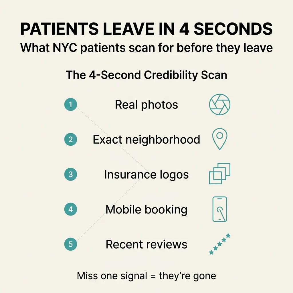
 I watched a Queens cardiology practice lose 60% of their Google traffic last month.
Their SEO was solid. Rankings were good. People found them.
But when those people landed on the site, something broke. The average session lasted four seconds.
Four seconds isn’t enough time to read a paragraph. It’s barely enough time to scan a page. But it’s exactly how long patients in New York City give you before they decide whether to book or bounce.
I build medical websites in Queens and Manhattan. I audit them weekly. The pattern never changes. Patients run the same credibility check, same order, every single time.
And most practices fail it without knowing why.
The Scanning Behavior You Can’t Ignore
Reading went out the window years ago.
When someone searches for a doctor in NYC, they’re not reading your About page. They’re not scrolling through your services. They’re scanning for five specific signals that answer one question: Can I trust this practice enough to book an appointment right now?
Miss one signal and they’re gone. Miss three and you never had a chance.
Here’s what patients check in the first four seconds, and what happens when each one is missing.
Signal #1: Real Photos of Real People
Stock photos kill credibility faster than anything else.
If the first face a patient sees is a smiling model with a stethoscope, they assume the practice isn’t real or isn’t established enough to have actual photos. They bounce.
I see this constantly. Practices spend thousands on a website redesign, then populate it with generic medical imagery from a stock library. The design looks polished. The trust factor drops to zero.
What works: Photos of the actual doctor. Photos of the actual office. Photos of the actual waiting room if it’s clean and welcoming.
Authenticity beats polish. Every time.
Patients want to see where they’re going and who they’re seeing before they commit to an appointment. Show them.
Signal #2: A Specific Neighborhood Address
New York City is not a neighborhood.
When your address says “New York, NY” and nothing else, patients assume you’re hiding your location or you’re not actually local. They want to know if you’re in their neighborhood or if they’ll need to commute.
“Midtown East” tells them something. “Upper East Side” tells them something. “Astoria, Queens” tells them something.
“New York, NY” tells them nothing.
Put the neighborhood above the fold. Make it visible without scrolling. Patients in Manhattan won’t book with a practice they think is in Brooklyn, and patients in Queens won’t travel to the Upper West Side unless they know that upfront.
Proximity matters. Make it clear.
Signal #3: Insurance Logos Where They Can See Them
This is the signal most practices bury.
Insurance acceptance is the first filter patients apply. If they can’t tell within four seconds whether you take Aetna, Cigna, UnitedHealthcare, or Empire BCBS, they leave and check the next result.
I’ve audited sites where insurance information was three clicks deep. I’ve seen it hidden in FAQ sections. I’ve seen practices list it in plain text at the bottom of a services page.
None of that works.
Patients need to see logos. Visual confirmation is faster than reading a list. Put the logos of the major plans you accept on the homepage, visible without scrolling.
If a patient has to hunt for this information, they won’t. They’ll find a practice where it’s obvious.
Signal #4: A Mobile Booking Button That Actually Works
Most medical sites in NYC fail this one completely.
Patients are on their phones. They want to book an appointment right now, while they’re thinking about it. If your booking process requires them to call during business hours or fill out a contact form and wait for a callback, you’ve added friction they don’t want to deal with.
Here’s what happens: They tap your phone number. Their phone opens the dialer. They see a queue. They hang up and try the next practice.
Or they fill out a form. They wait. They forget. They book somewhere else.
One tap to a real calendar. That’s the standard now. Online scheduling tools integrate with your site. Patients pick a time, confirm, and they’re done.
The practices that make booking easy get the appointments. The ones that make it complicated lose them to competitors who figured this out years ago.
Signal #5: Recent Google Reviews with Names and Dates
Five stars from “Patient A” in 2019 moves nobody.
Patients want recent proof. They want to see that other people booked appointments recently, showed up, and had good experiences. First names and dates make reviews feel real. Anonymous ratings from three years ago feel staged or outdated.
I see practices with excellent reputations fail to display their reviews properly. The reviews exist on Google, but the homepage doesn’t show them. Or it shows a testimonial from 2018 that sounds like it was written by the marketing team.
Embed recent Google reviews on your homepage. Show the reviewer’s first name. Show the date. Show at least three to five reviews so it doesn’t look cherry-picked.
Patients trust other patients. Give them something to trust.
What Happens When Signals Are Missing
I audit medical websites in NYC every week. Out of the five signals, most practices get two right. Sometimes one.
When signal #1 is missing, patients question whether the practice is real.
When signal #3 is missing, they assume you don’t take their insurance.
When signal #4 is missing, they book with the practice where scheduling was easier.
Each missing signal creates doubt. Doubt creates hesitation. Hesitation creates a bounce.
And in a city where patients have dozens of options within a five-mile radius, doubt is enough to lose them.
The Fix Isn’t a Redesign
Most practices think they need to rebuild their website from scratch.
They don’t.
The five signals I’ve outlined here aren’t about design trends or visual overhauls. They’re about putting the right information in the right place, where patients are already looking.
You don’t need a new site. You need the right five things visible in the first four seconds.
Real photos above the fold. Neighborhood address in the header. Insurance logos on the homepage. A booking button that works on mobile. Recent Google reviews embedded where patients can see them.
That’s the credibility stack. That’s what converts scanners into patients.
Which Signal Is Your Site Missing?
If you run a medical practice in New York City and you’re losing patients faster than you’re booking them, one of these five signals is missing or buried.
I see this every week. The pattern is consistent. The fix is straightforward.
Check your site against the five signals. Find the gap. Fix it first.
If you’re not sure which one to prioritize, I can tell you. I audit medical sites in Queens and Manhattan regularly. I know which signal matters most for your specialty and your neighborhood.
Reach out. I’ll walk you through it.