Selected Work. Real Results.
A collection of conversion-focused websites and SEO campaigns
built to drive measurable growth, not just look good.
built to drive measurable growth, not just look good.
More Projects
Vitality Spa
Custom Web Design & WordPress Development
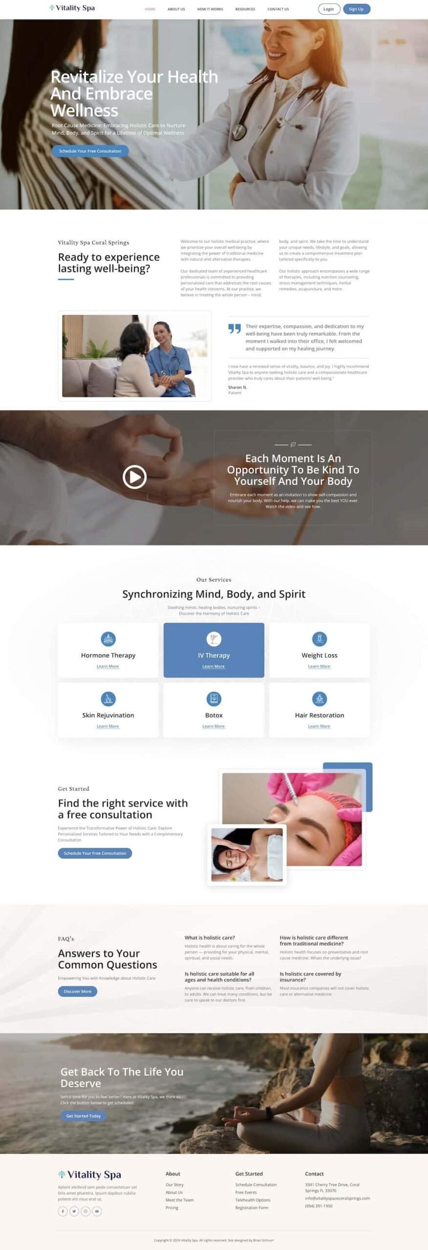
I designed the website for Vitality Spa, a medical and wellness center in New York City, New York, that focuses on uncovering the root causes of health issues.
The site integrates engaging videos, custom icons, and effective call-to-actions to guide users through their offerings.
The goal was to create an inviting, informative platform that reflects the center’s holistic approach to health while making it easy for visitors to explore services and book appointments.
Scroll Me!
Scroll Me!
Horizon Builders Inc.
Custom Web Design & WordPress Development
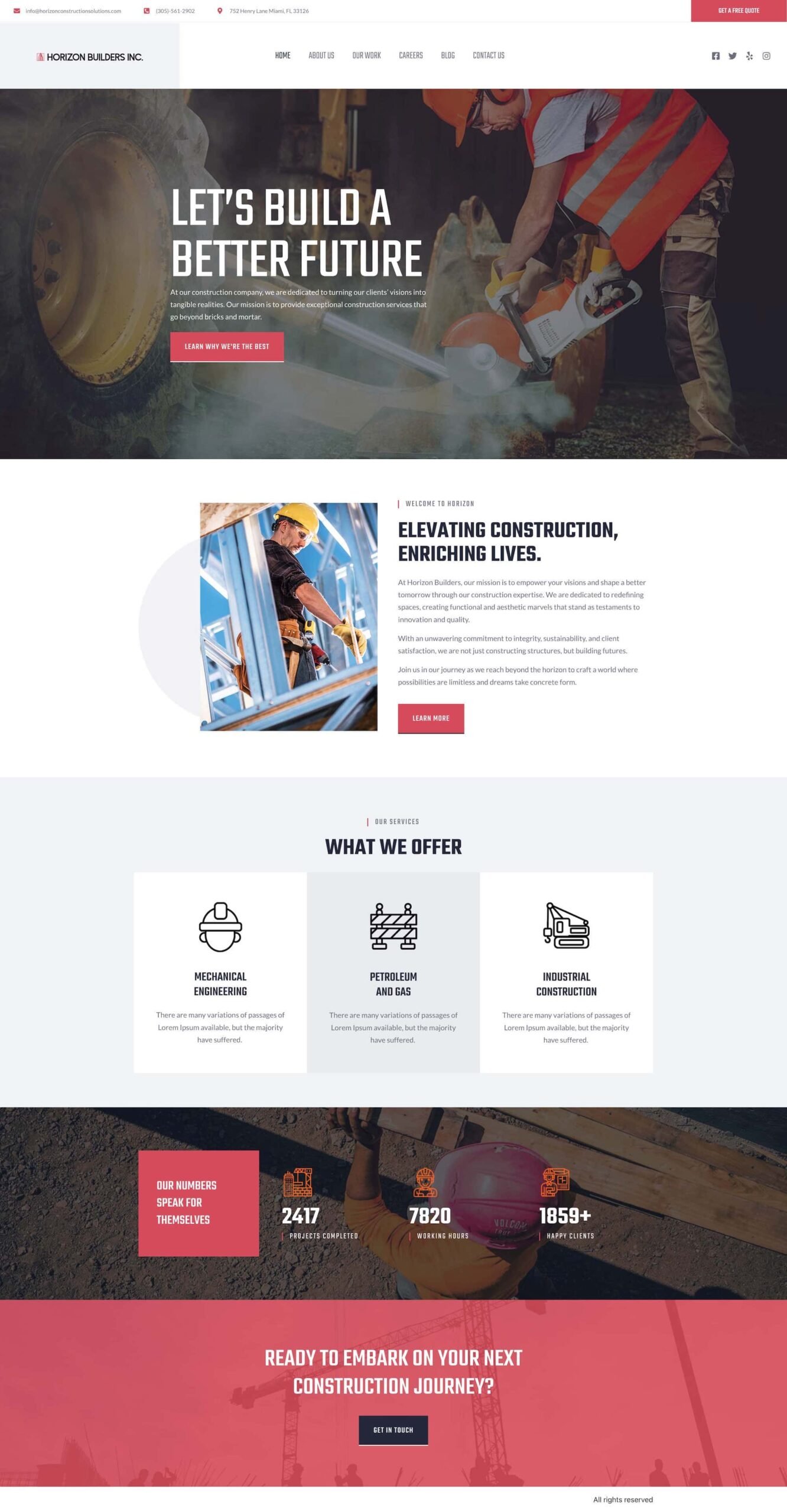
I had the privilege of designing the website and branding for Horizon Builders Inc., a custom construction company based in South New York.
The site reflects their expertise in creating high-quality, personalized construction projects. I focused on a clean, professional design that highlights their services and past projects, while ensuring an intuitive user experience.
The branding I created aligns with their strong, dependable reputation in the construction industry, providing a modern and cohesive online presence.
TuneTown
Custom Web Design & WordPress Development
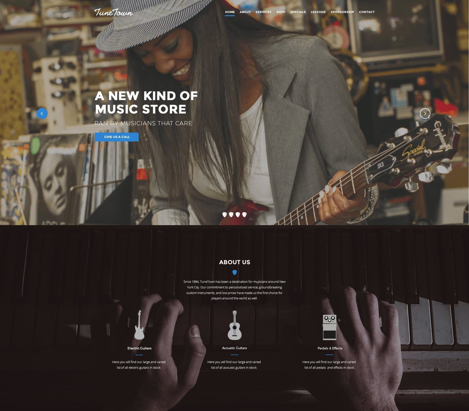
I designed a dynamic, engaging website for Tunetown, a large music store offering a wide range of instruments and accessories.
The site features a custom icon set to enhance navigation and a striking hero section that draws visitors in. I also highlighted their extensive services, making it easy for customers to explore product offerings, repair services, and lessons.
The goal was to create an interactive online presence that reflects Tunetown’s vibrant, music-focused community.
Scroll Me!
Scroll Me!
Whimsy & Wonder
Custom Web Design & WordPress Development
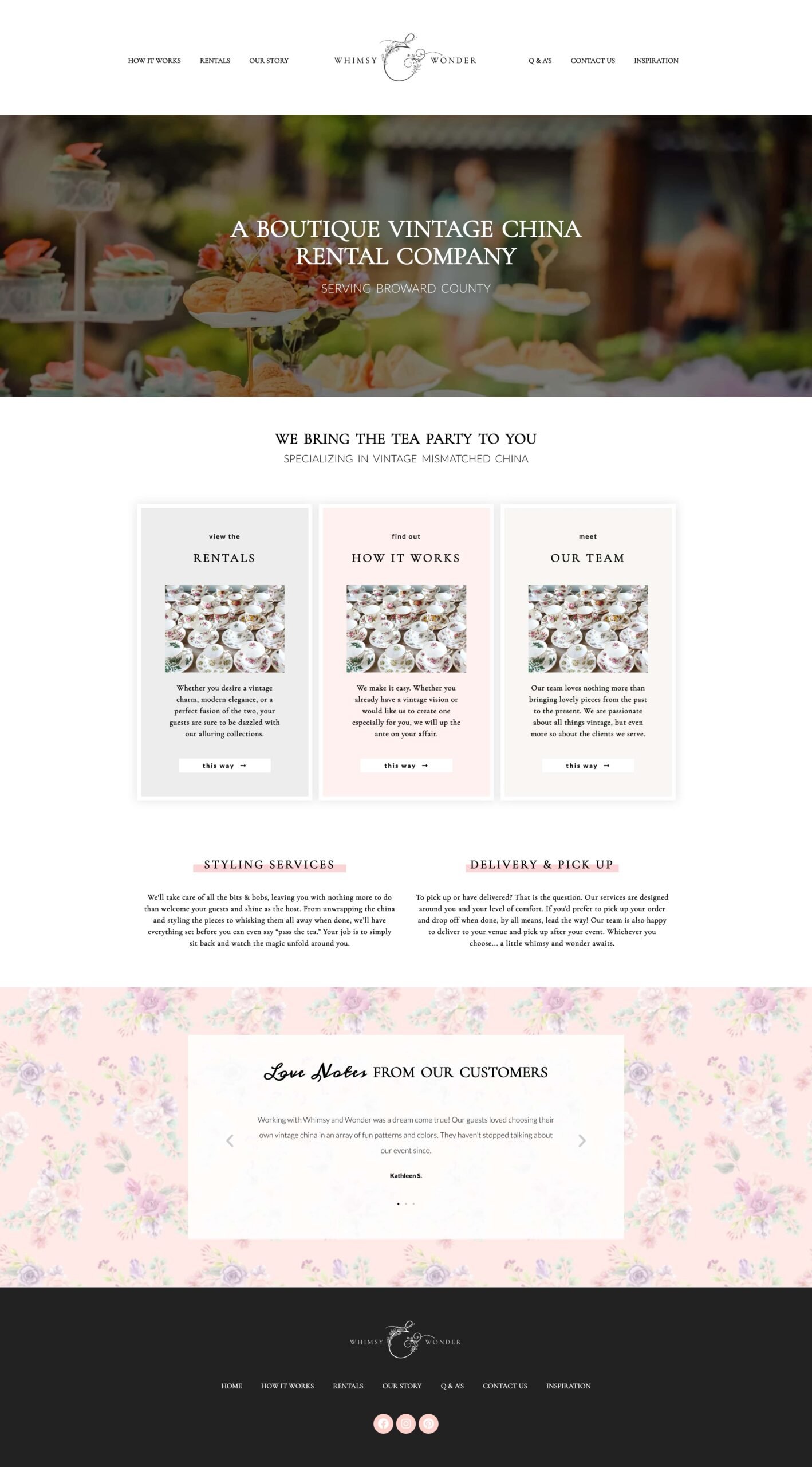
I had the pleasure of designing the website and logo for Whimsy and Wonder, a boutique vintage china rental company serving Broward County, Florida.
The website captures the elegance and sophistication of their high-end china collection, creating an inviting, luxurious online experience for customers planning special events.
The logo, designed to be both timeless and memorable, reinforces the company’s unique blend of vintage charm and modern elegance, aligning perfectly with their brand’s identity in the event rental industry.
